HexCity: Toronto Crime Aftershock Map
Detects “aftershock” crime clustering (≤250 m, ≤14 days) and flags new/intensifying hotspots.
View Project →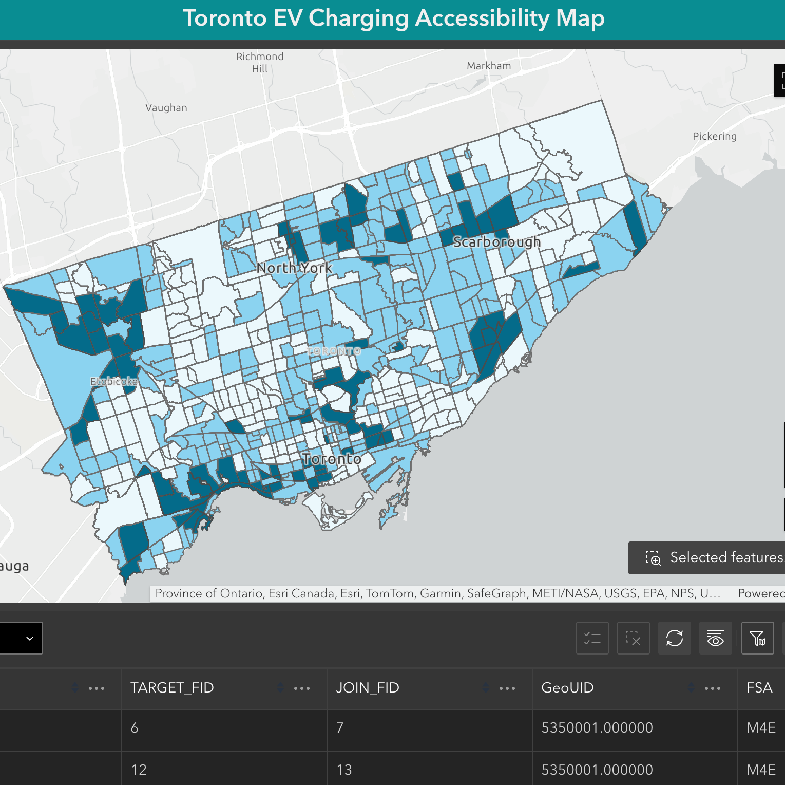
Toronto EV Charging Accessibility Map
As Toronto accelerates its push toward net-zero by 2040, this interactive map identifies underserved neighborhoods with high EV charging demand across 585 census tracts. Using a composite scoring system based on EV ownership, apartment density, transit access, and income levels, the tool helps planners and policymakers prioritize equitable, data-driven charging infrastructure expansion.
View Project →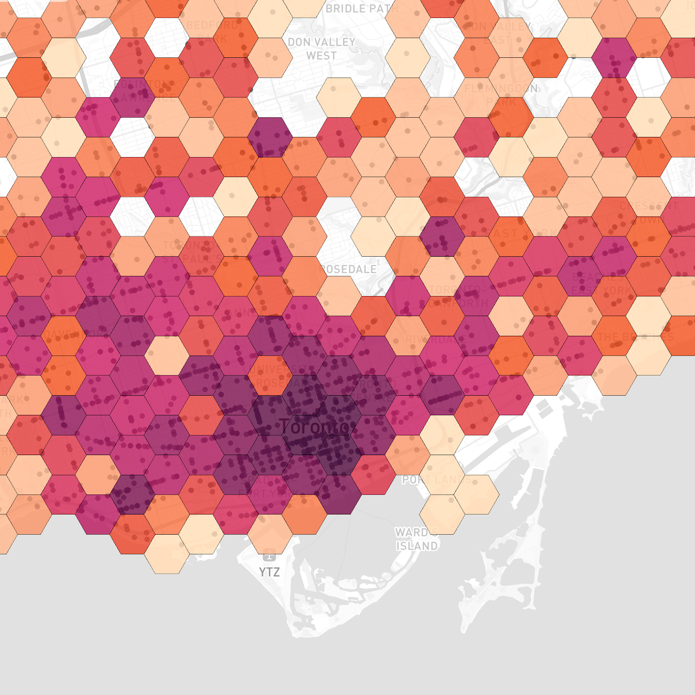
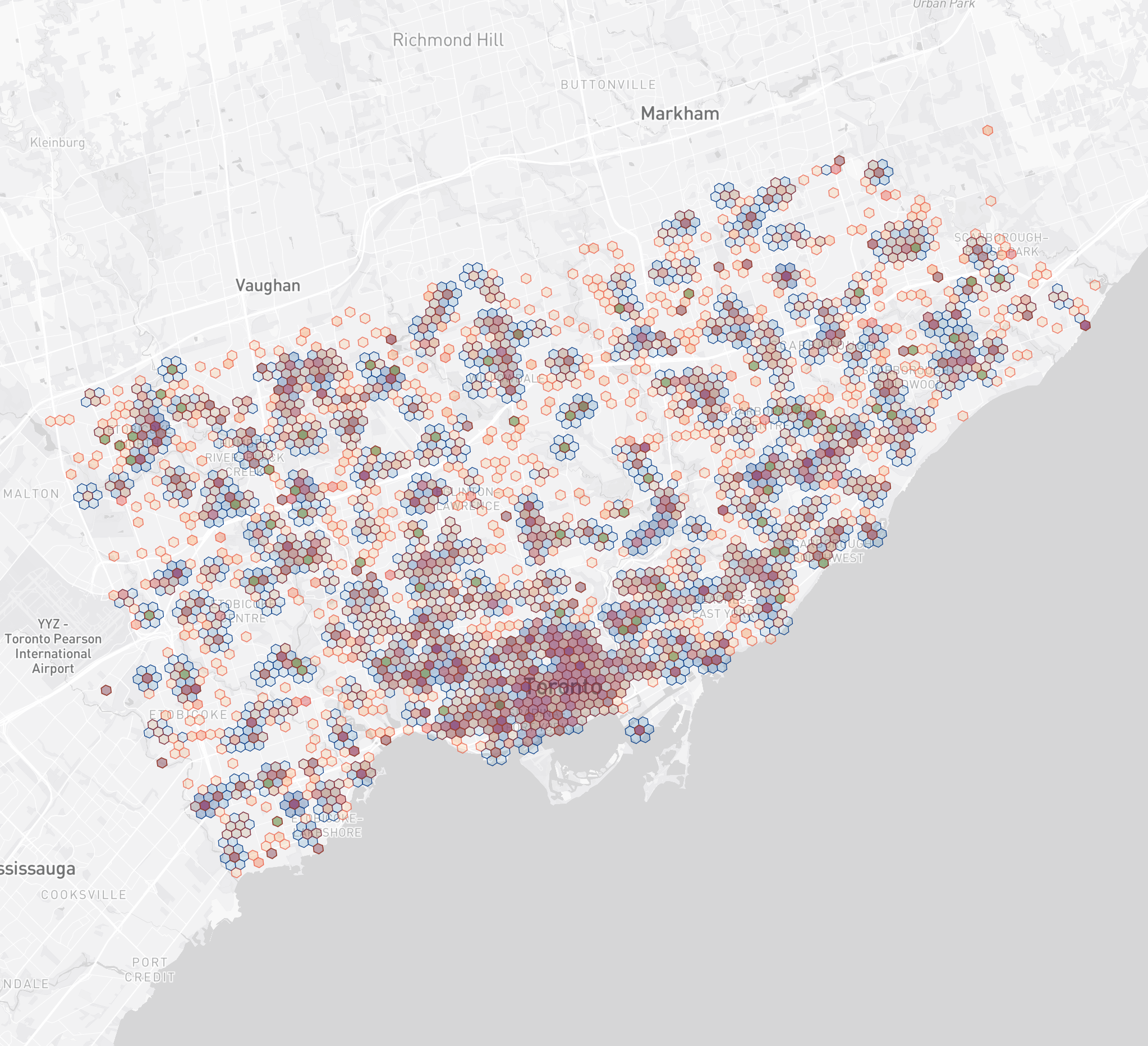
Toronto Collision Web Map
An interactive hexbin web map built with Turf.js and Mapbox GL to visualize Toronto traffic collisions spatially and statistically.
View Project →
Notes from the Radiu3 Web Map
A creative sound-story experience visualized through a custom web map built with Mapbox, showcasing music, film, and cultural data near U of T.
View Project →
Senior Renters Displacement in Hamilton
This spatial analysis highlights the impact of rising rents on senior renters' access to dementia care using accessibility metrics and isochrones.
View Project →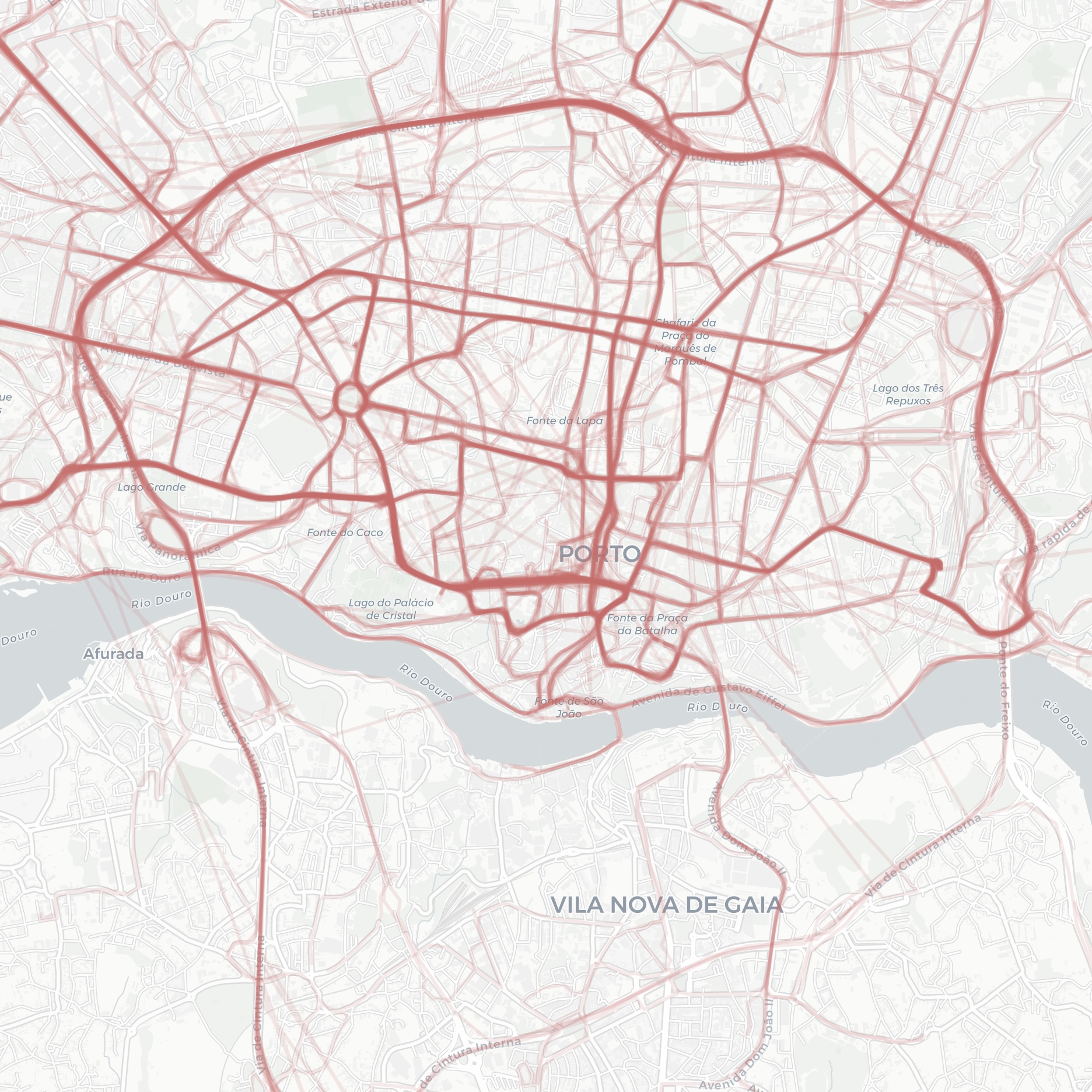
Geospatial Data Visualization with Python & Folium
Visualizes geographic data using Python and Folium, with a focus on rendering location patterns and clustering techniques.
View Project →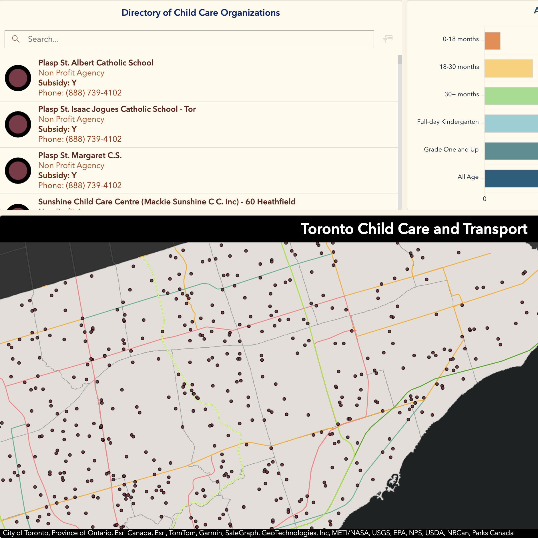
Toronto Child Care & Transit Dashboard
An interactive dashboard that compares child care center locations with nearby transit infrastructure to support planning equity.
View Project →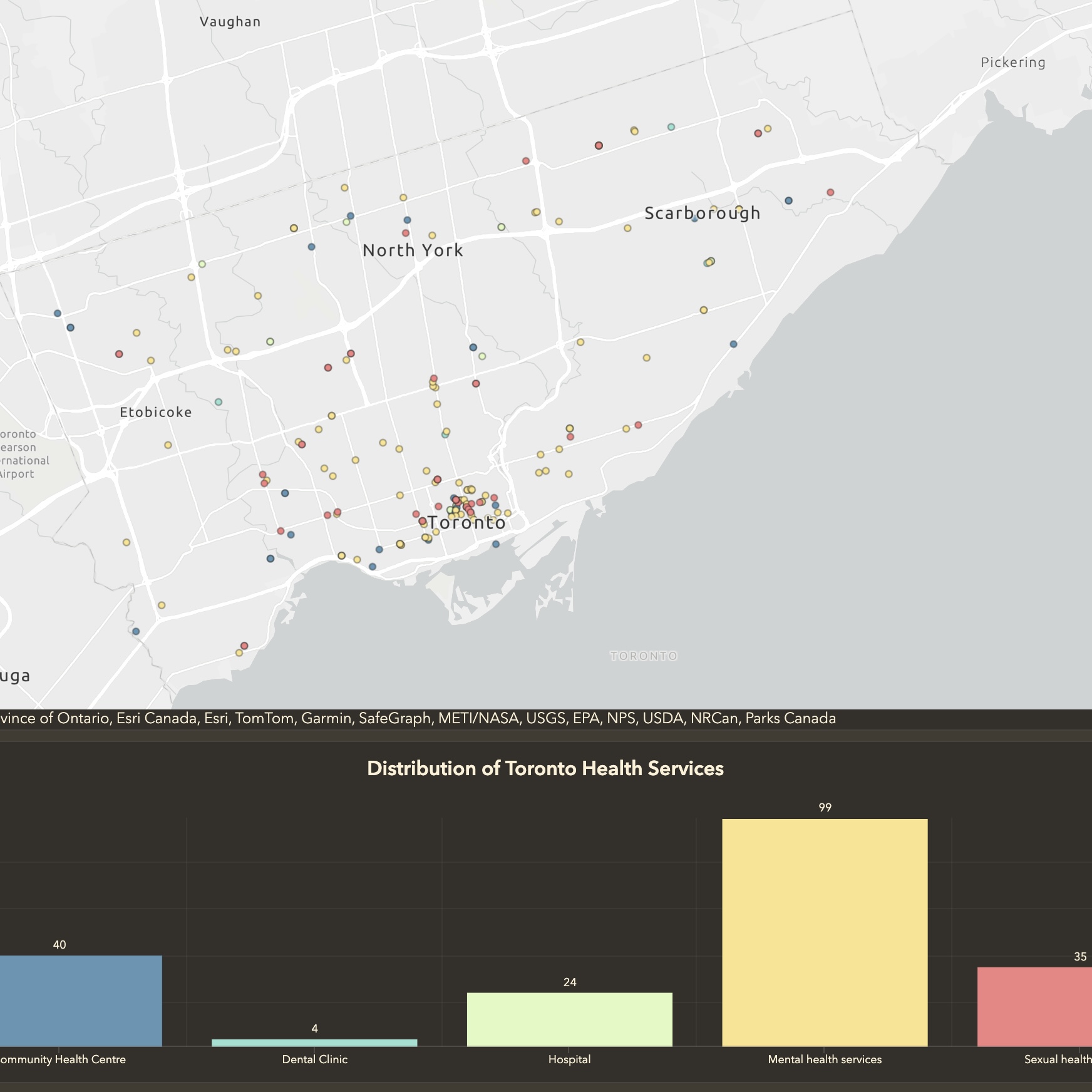
Toronto Health Services Map
A multilingual-selectable interactive map built with Mapbox to show access to Toronto's public health resources by community.
View Project →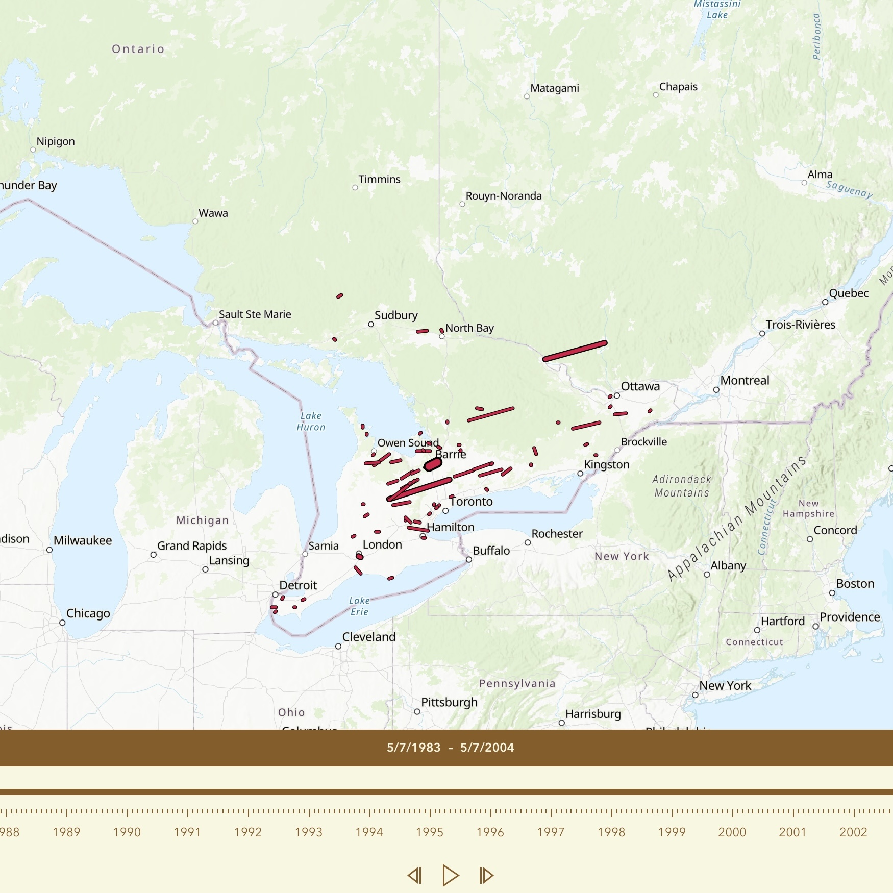
Toronto Tornado Track Animation
Animated track of Toronto's tornado events using web map technology, temporal sequencing, and data storytelling for public awareness.
View Project →